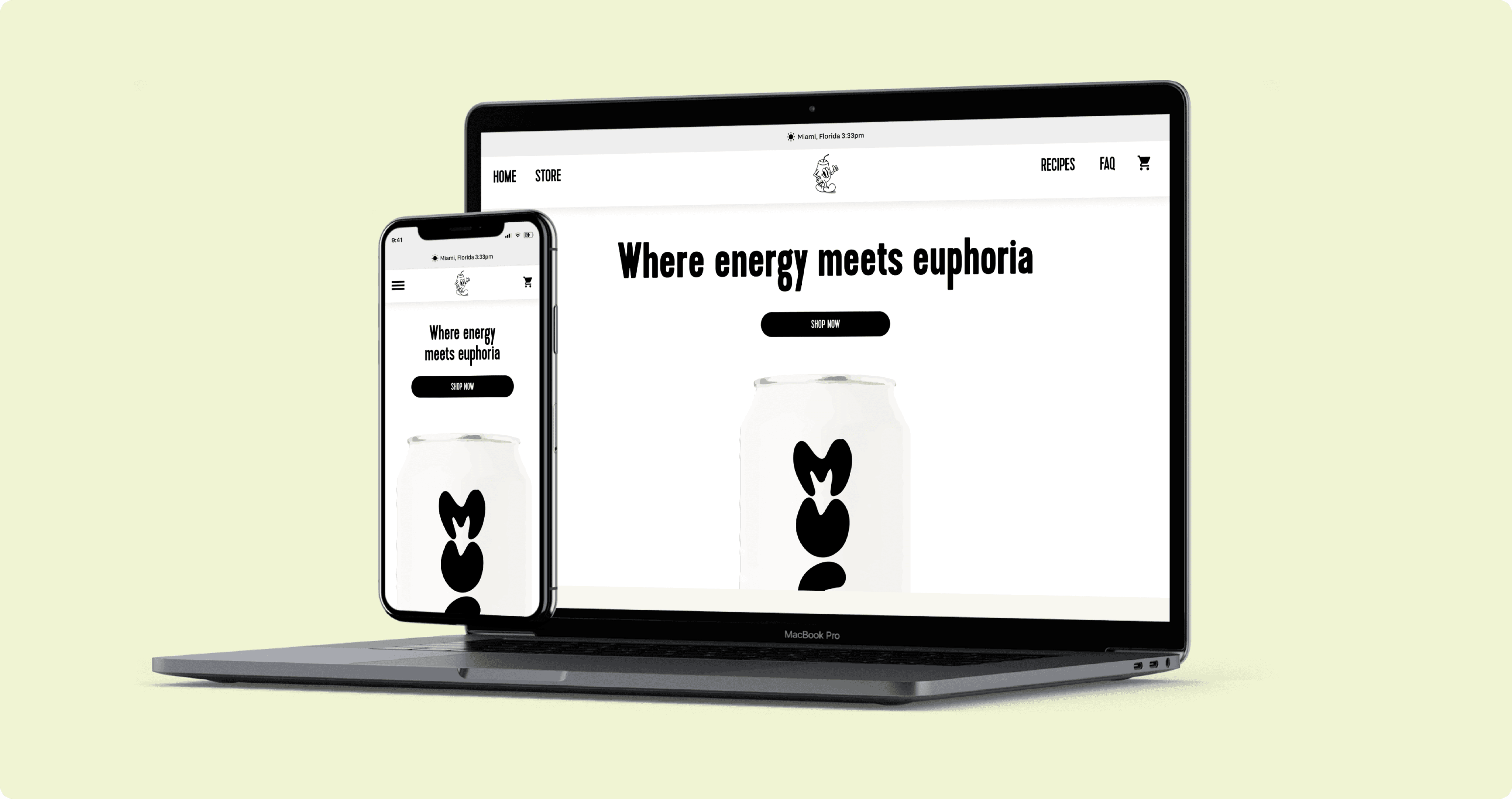
MUCHO MATE - E-COMMERCE WEBSITE / UX UI PROJECT
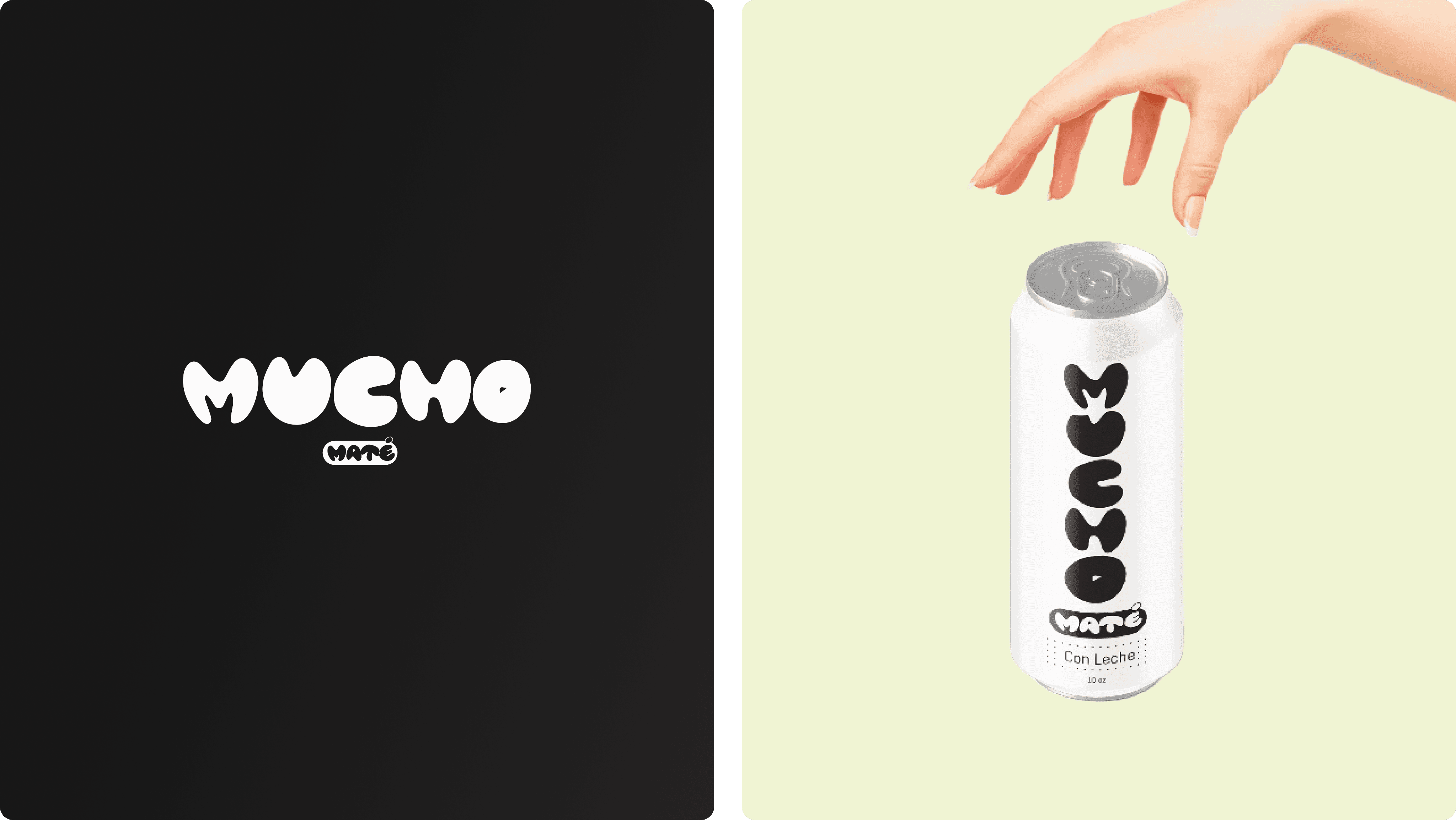
Mucho is a Miami based mate beverage company tailored to a young demographic looking for a healthier alternative to coffee. Mate is currently in their final stages before launching.
Assigned of:
Initial research
Lo-fi & Hi-fi wireframes
Photography assistance
User testing
Problem & Solution
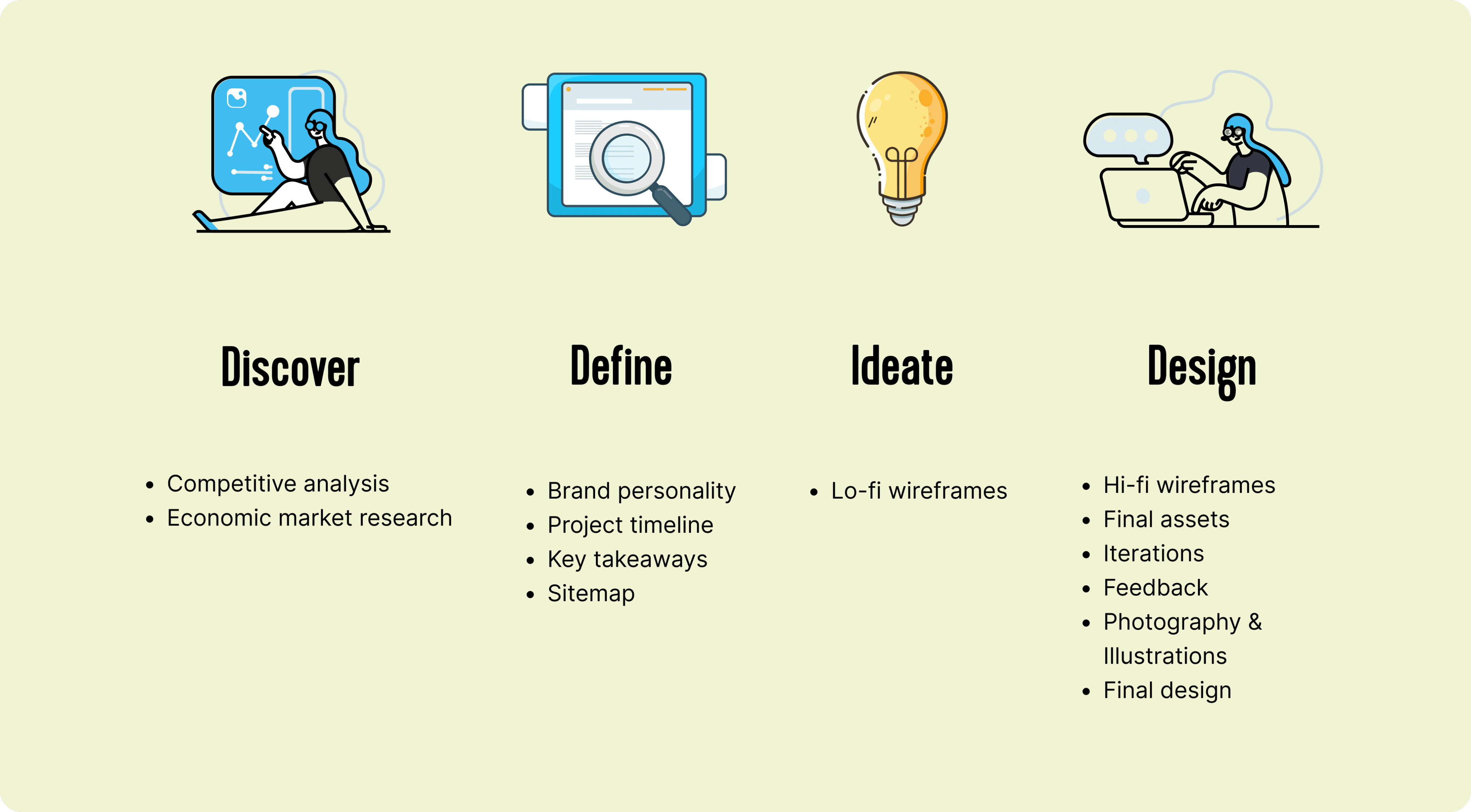
Design Process
The logo and mascots were provided to me during the design process. The idea of the stakeholder was to have an emblematic symbol easy to recognize when you think of mate which in this case was the mate cup highlighting the fun personality of the brand. The website design was based on these characteristics.
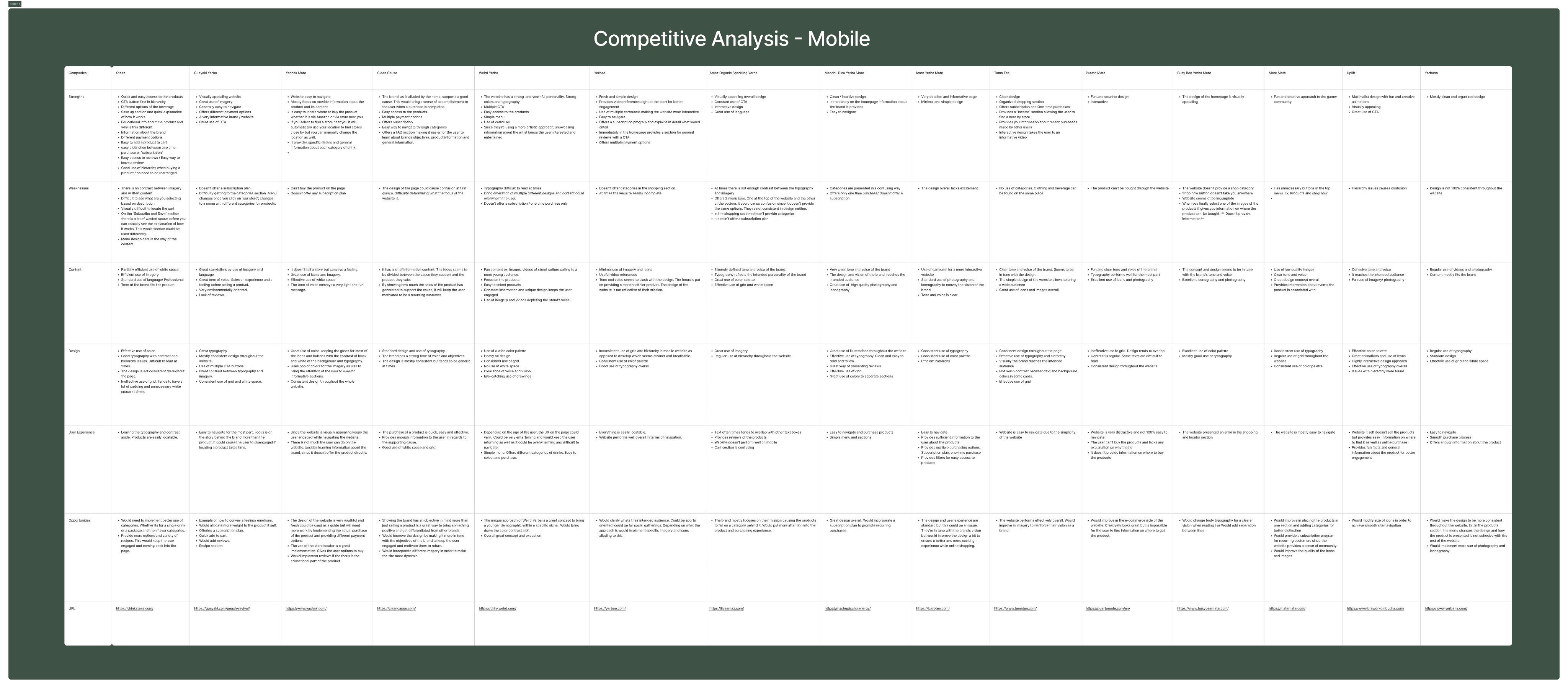
Key takeaways:
Majority of the websites have similar menu pages (Shop/products, blog, about us, contact us).
Around a 60% of the websites offered subscription plans.
Use of CTA buttons on homepage directing users to products.
Around 80% of the websites focus on having an entertaining homepage design promoting better engagement.
Majority of websites did not have categories for products/doesn’t seem to be necessary for the user.
Lack on accessibility in some websites due to low contrast in the design.
Websites showed a clear concept of the brand overall leaving an impact on the user.
Consistent use of imagery and typography throughout the pages.
Websites that showed great performance provided an easy and simple shopping experience. Ex: Different payment options, where to find the products, easy access to subscription plans and easy management of subscription settings.
Easy access to reviews.
Based on these assumptions we will continue by creating the structure of the website and work on iterations. This will provide valuable information and will help us prioritize and organize the pages and elements that will be included on the same.
COMpetitor analysis
Sitemap

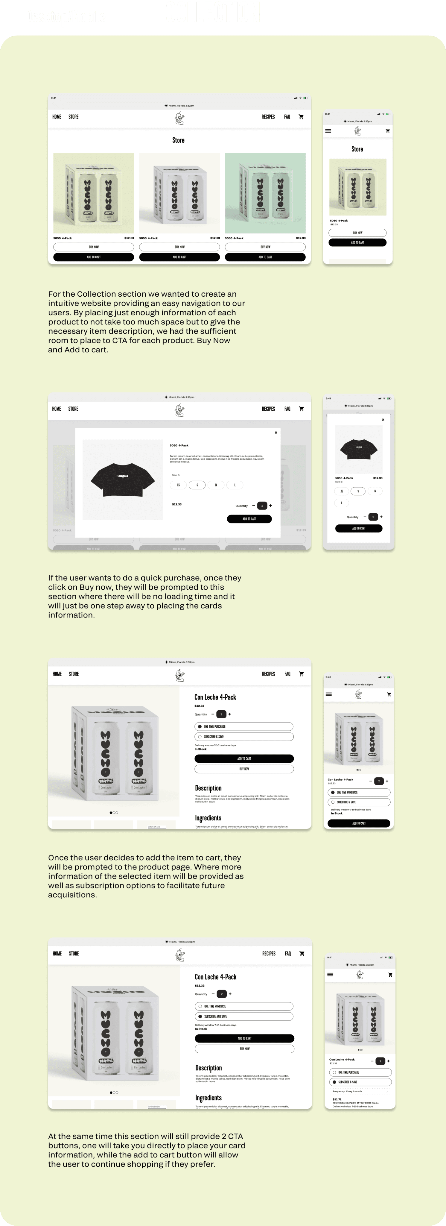
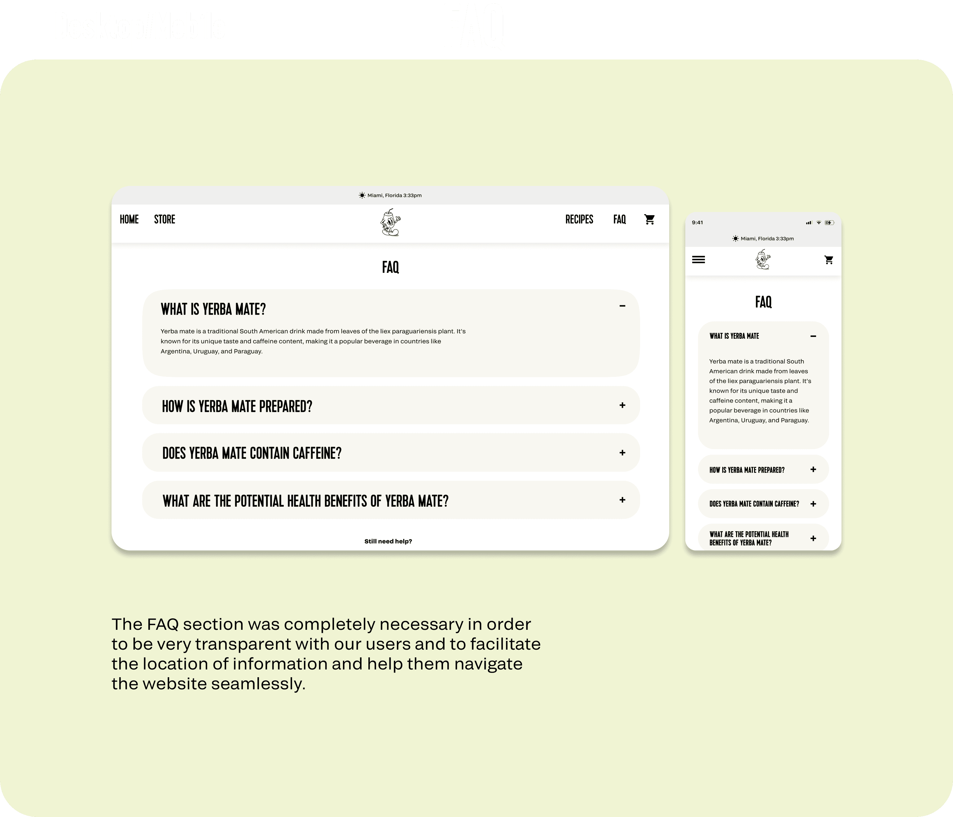
The following sitemap proposes the best practices to achieve these results based on the data provided by the research previously performed. From this point, our approach for Mucho Mate website was to minimize the number of pages, allowing us to reach said goals. The website will be composed by a homepage where it will showcase customers opinions and experiences about the product alongside fun and creative photography and imagery, an account option for the user to manage their settings regarding subscription plans and lastly a menu. The menu will display multiple sections such as collection, contact us, blog, about us and FAQ. Is worth mentioning the homepage will provide ways to be interconnected with the Collection section to allow easy access and motivate the users to check the products.
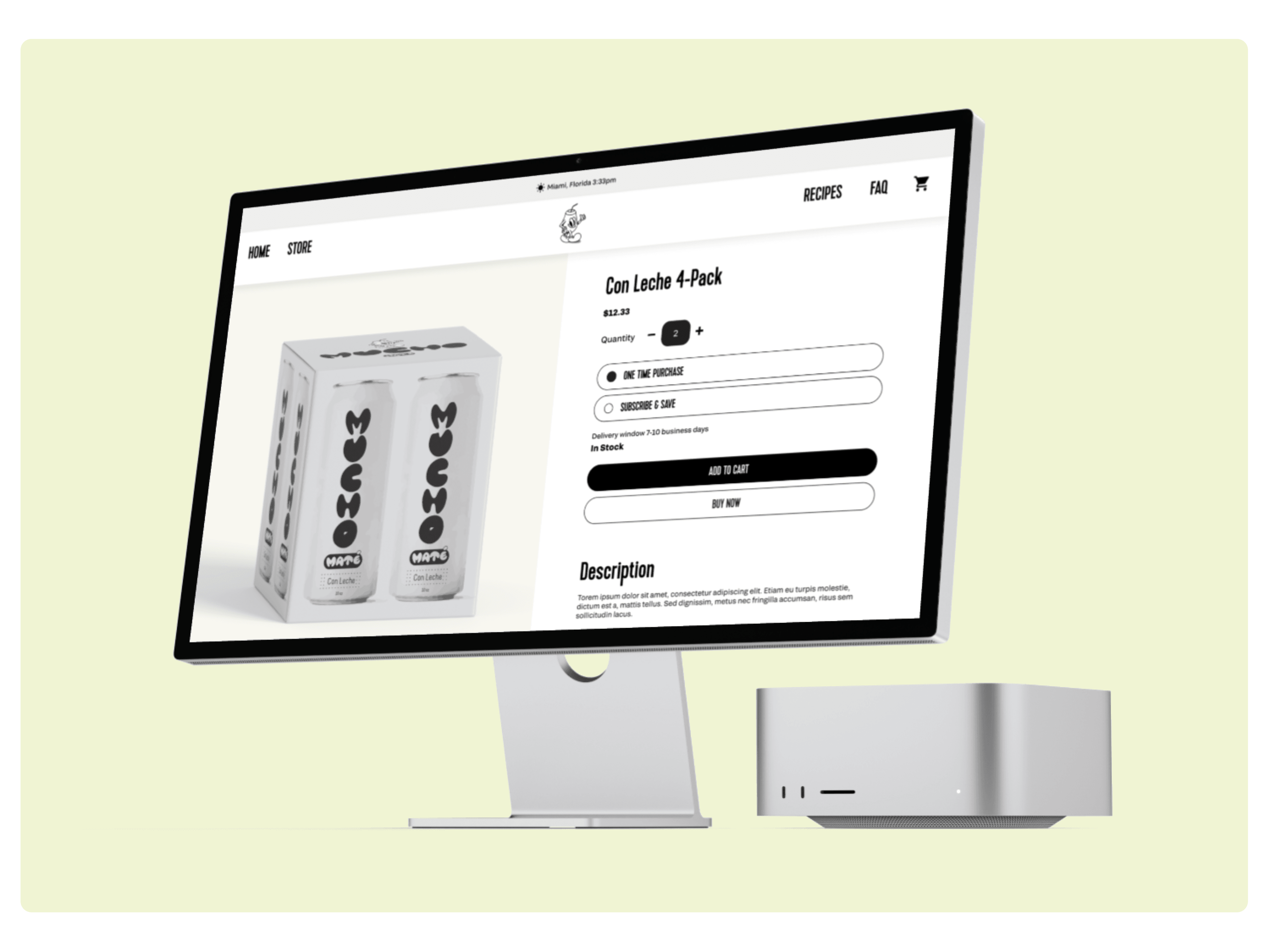
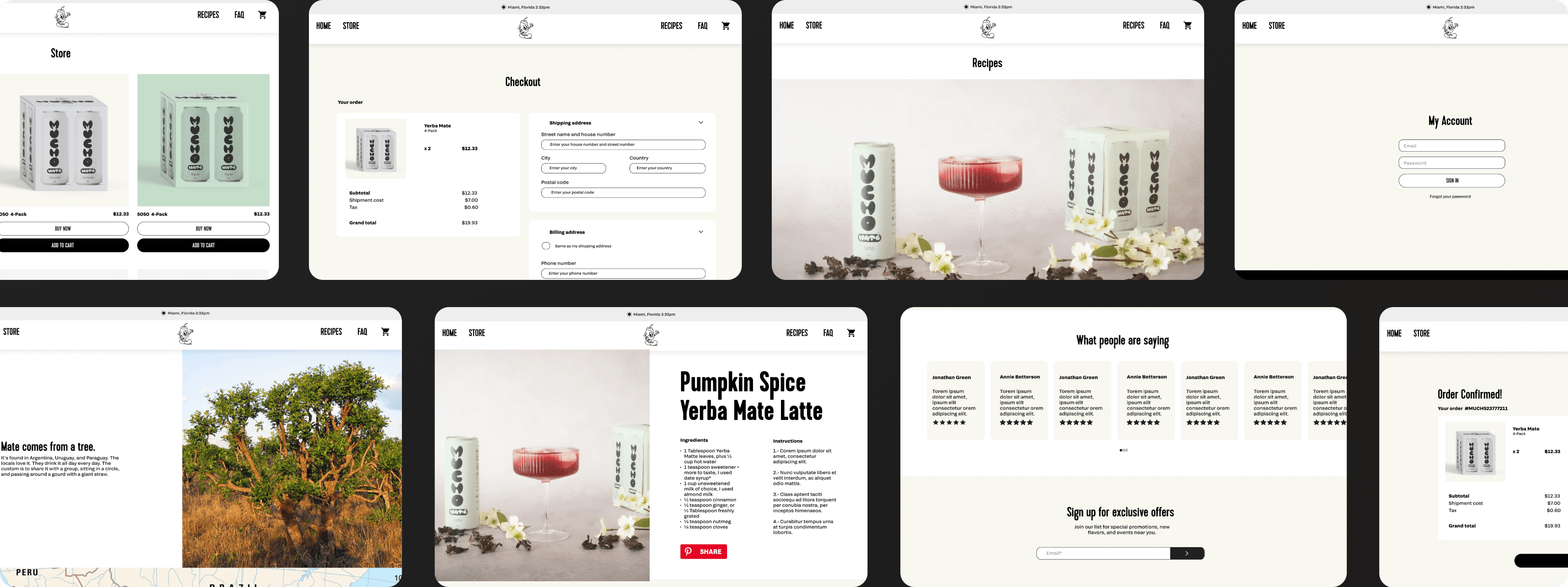
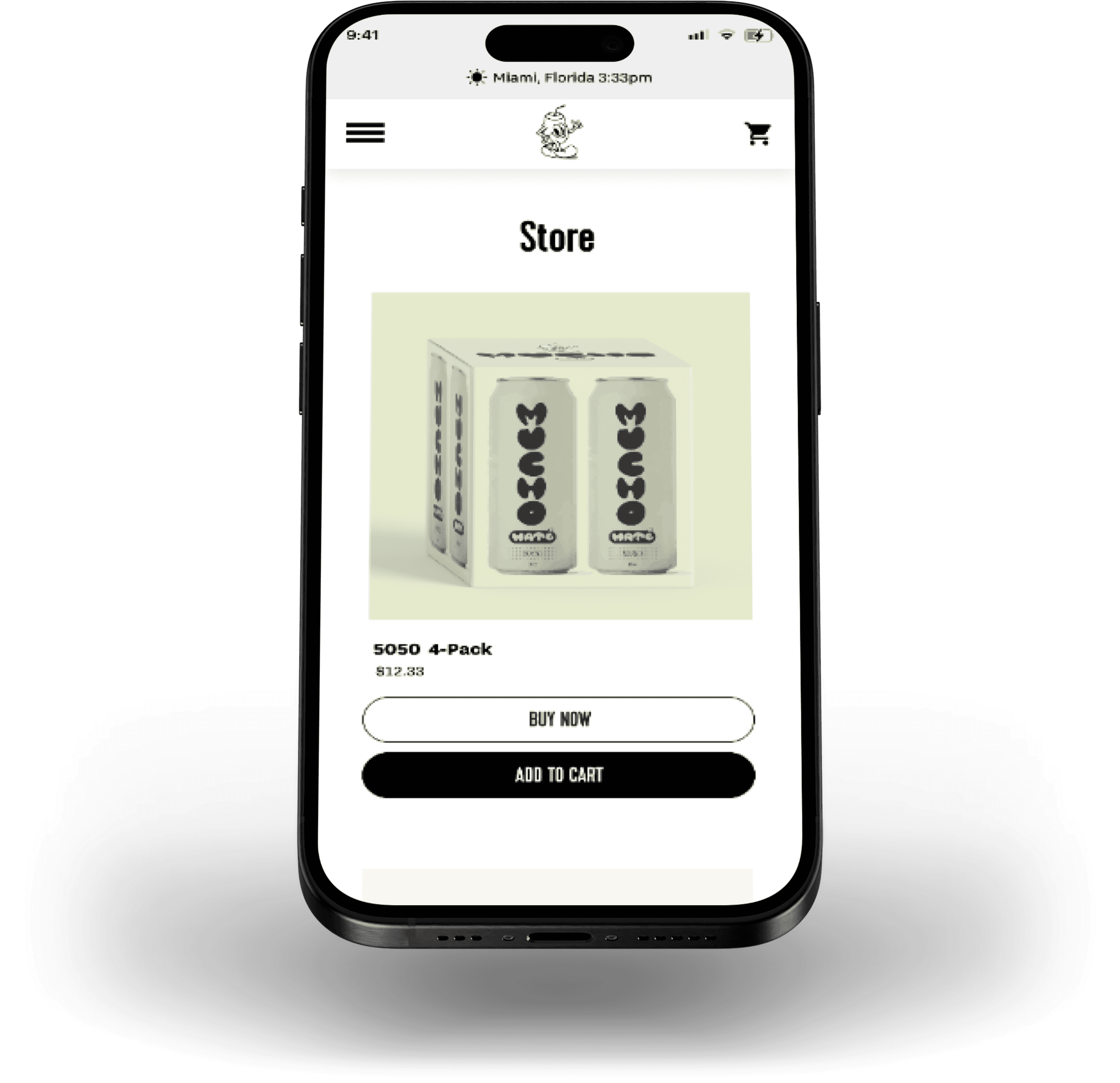
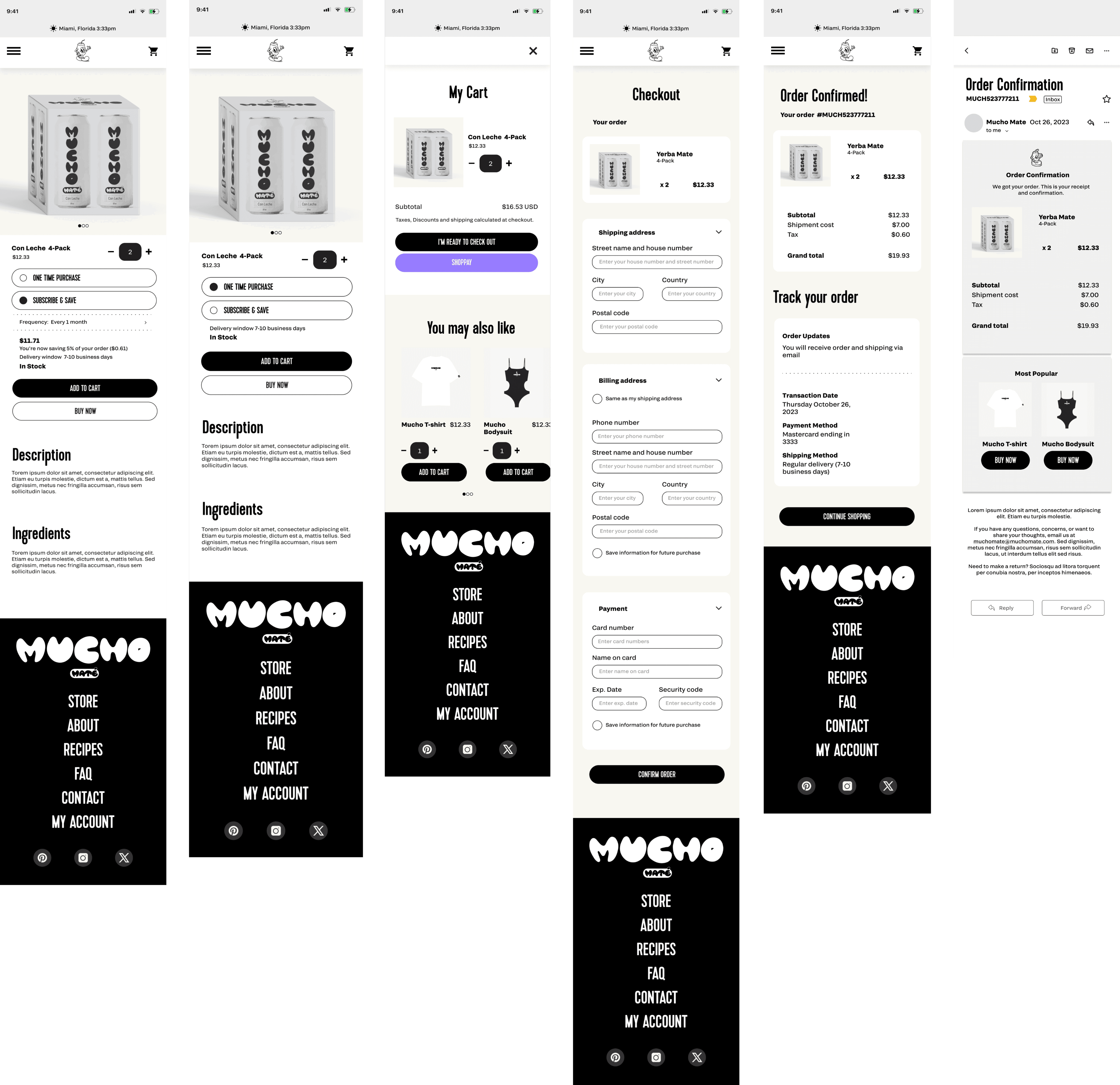
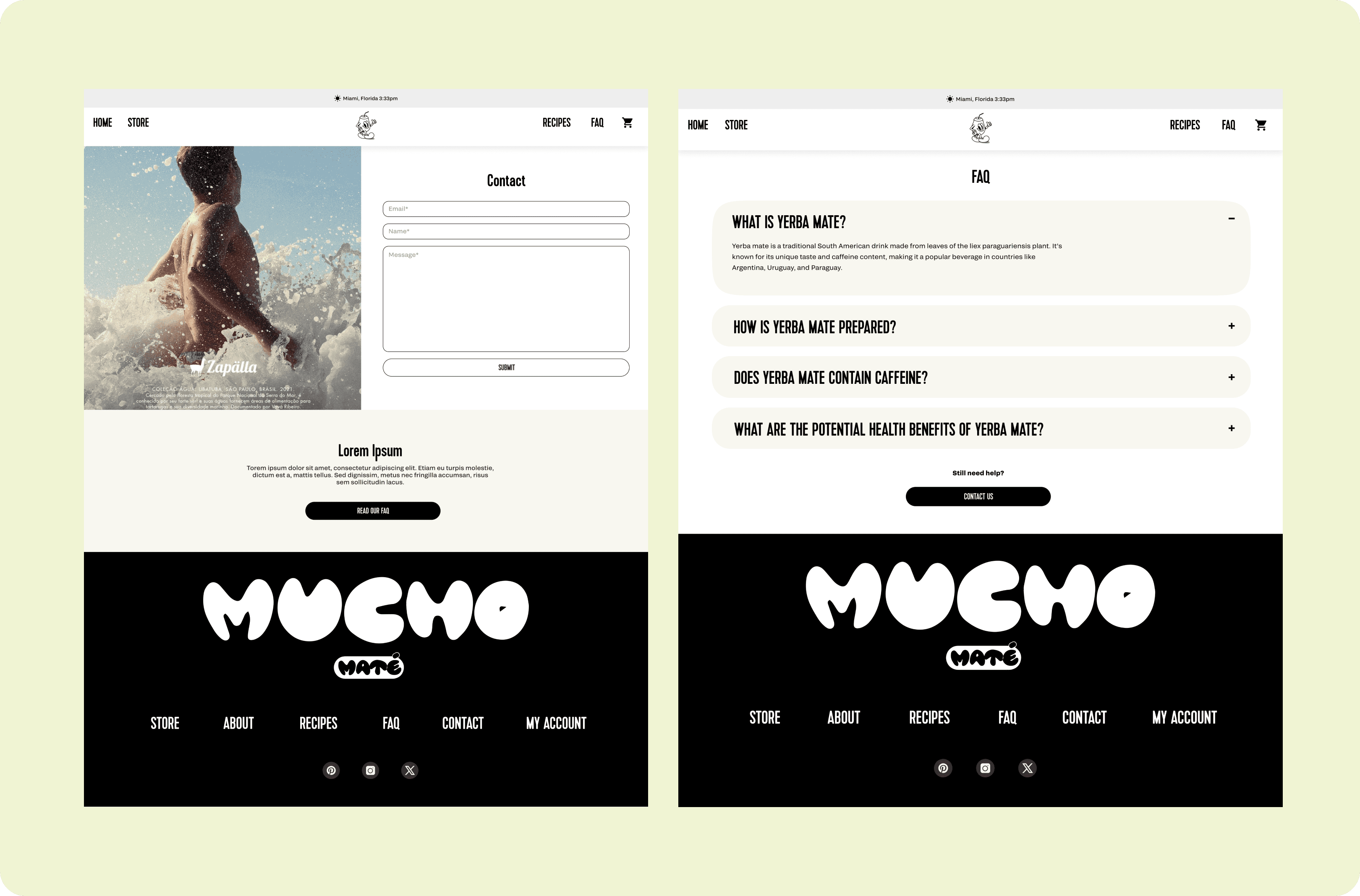
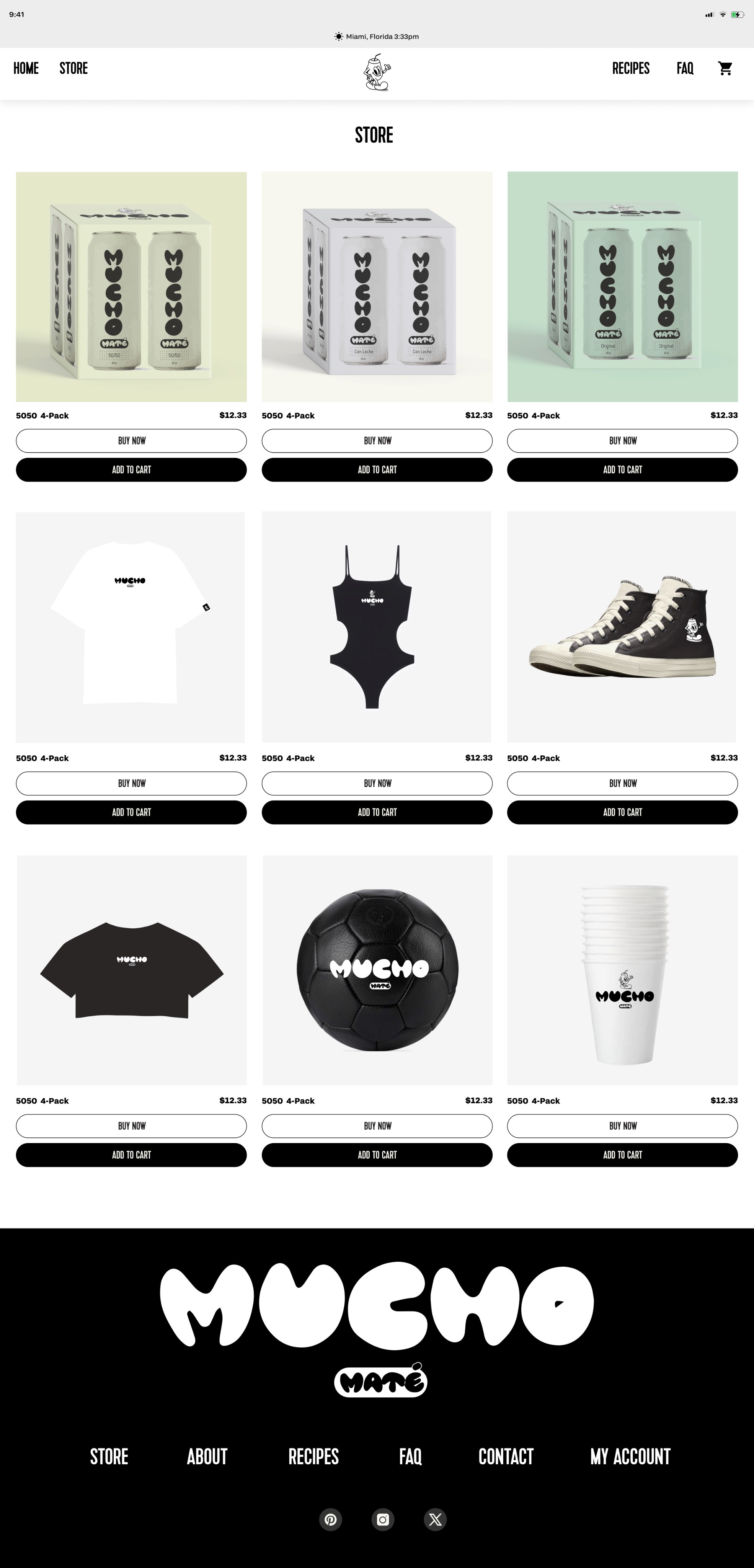
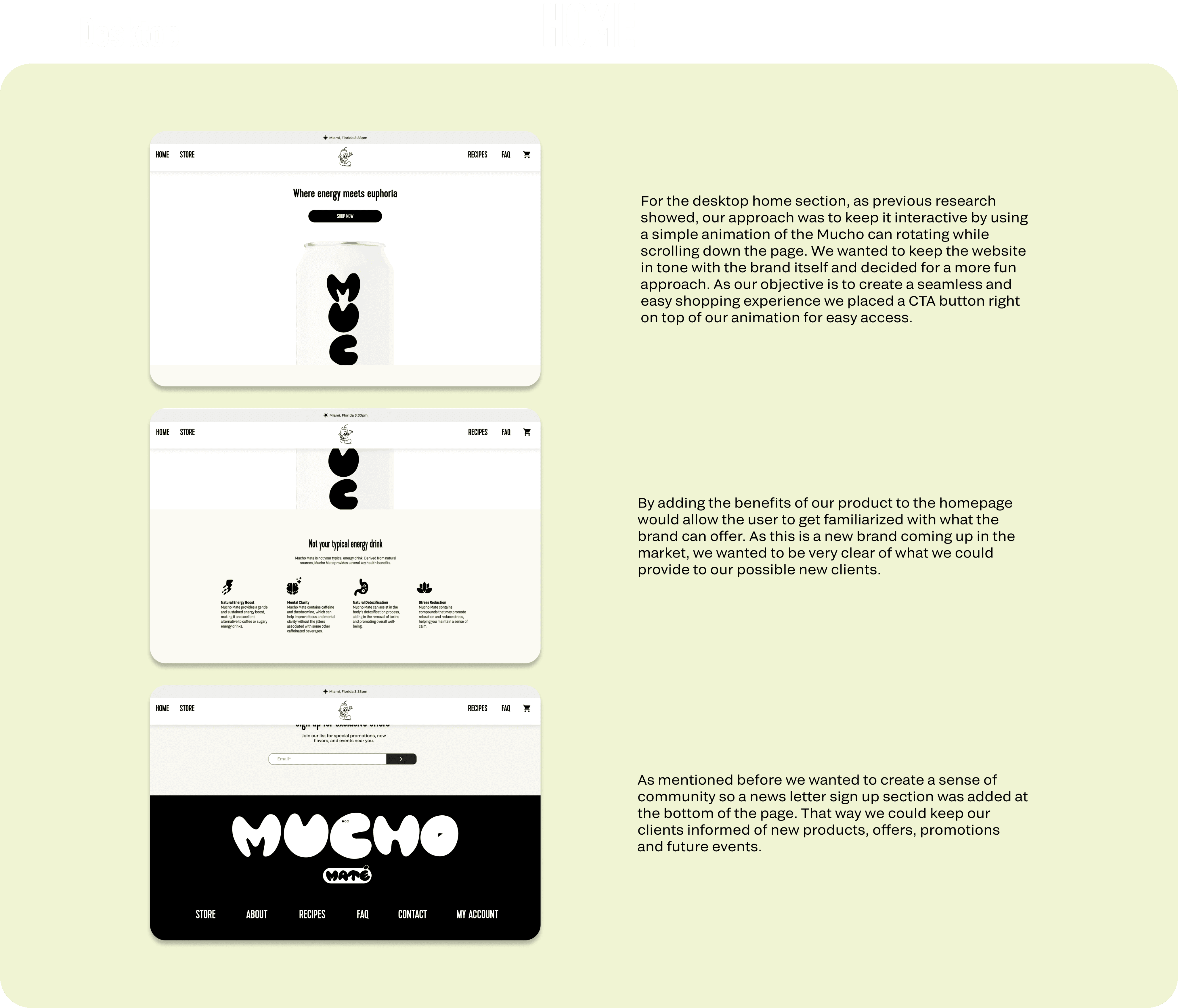
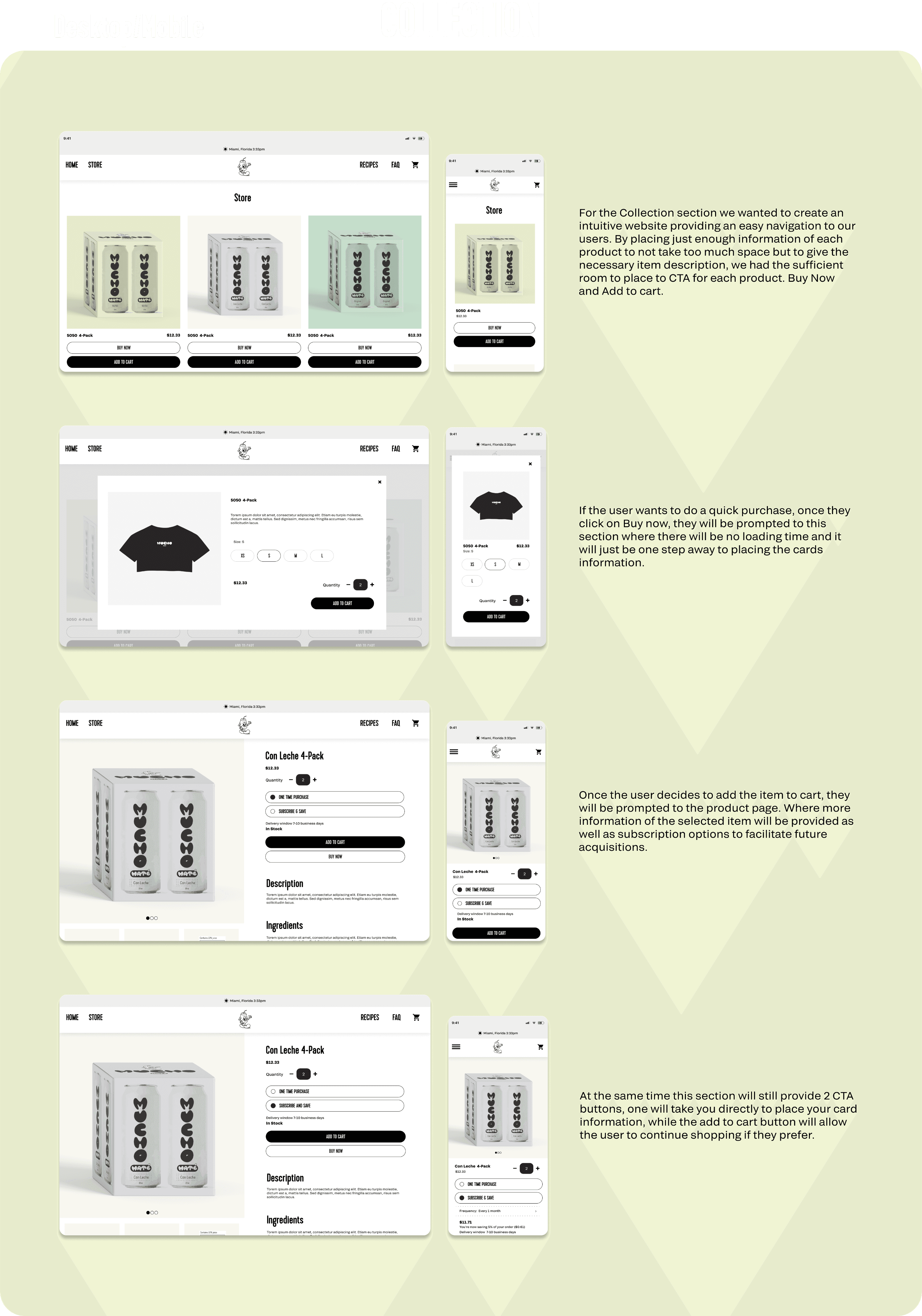
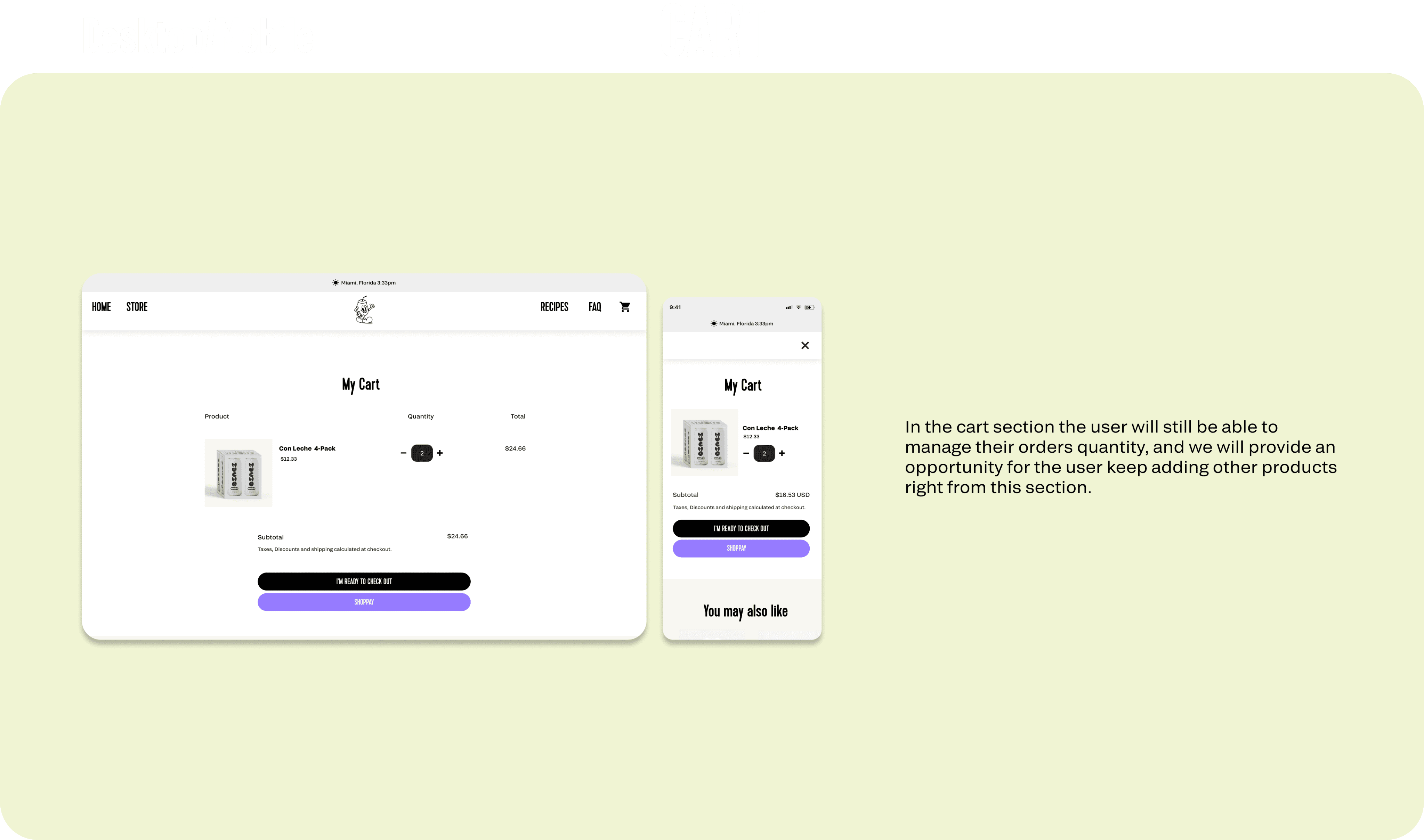
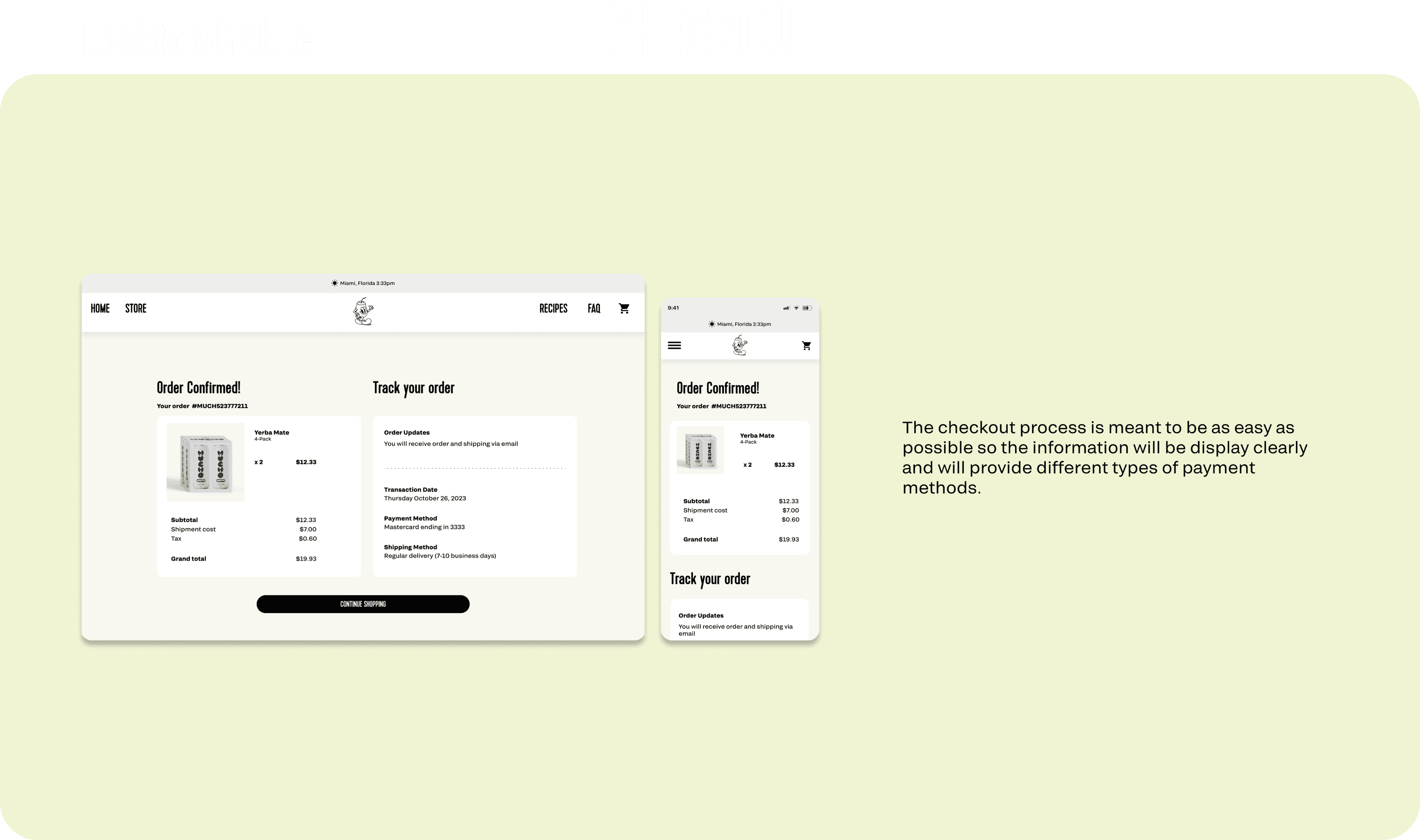
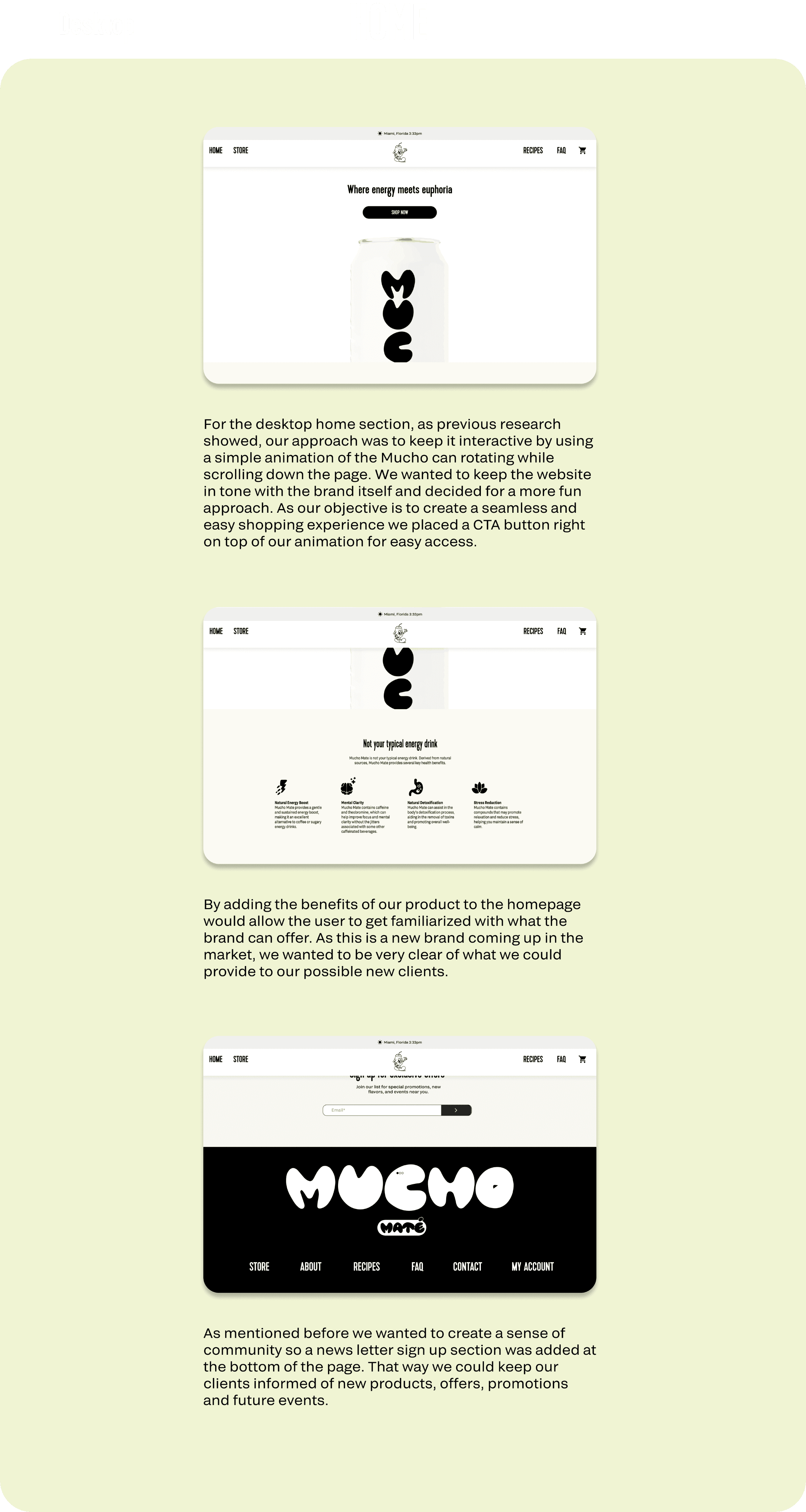
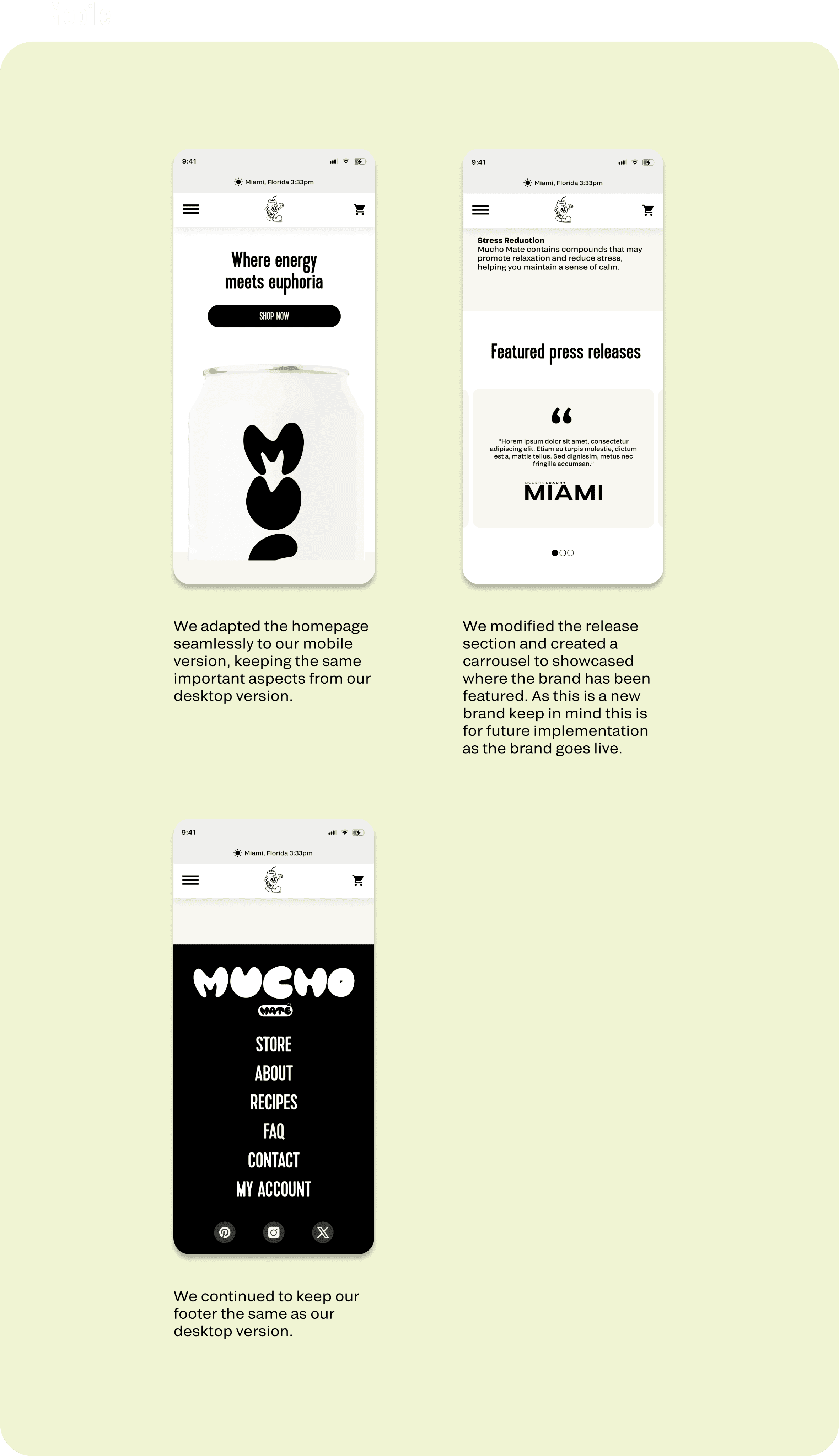
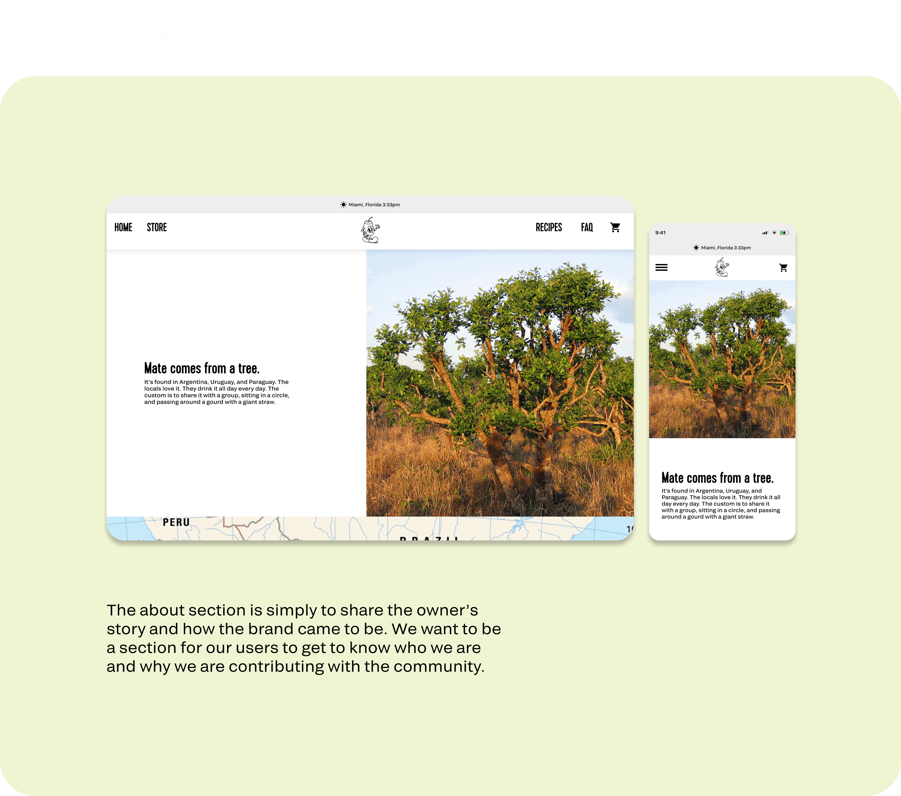
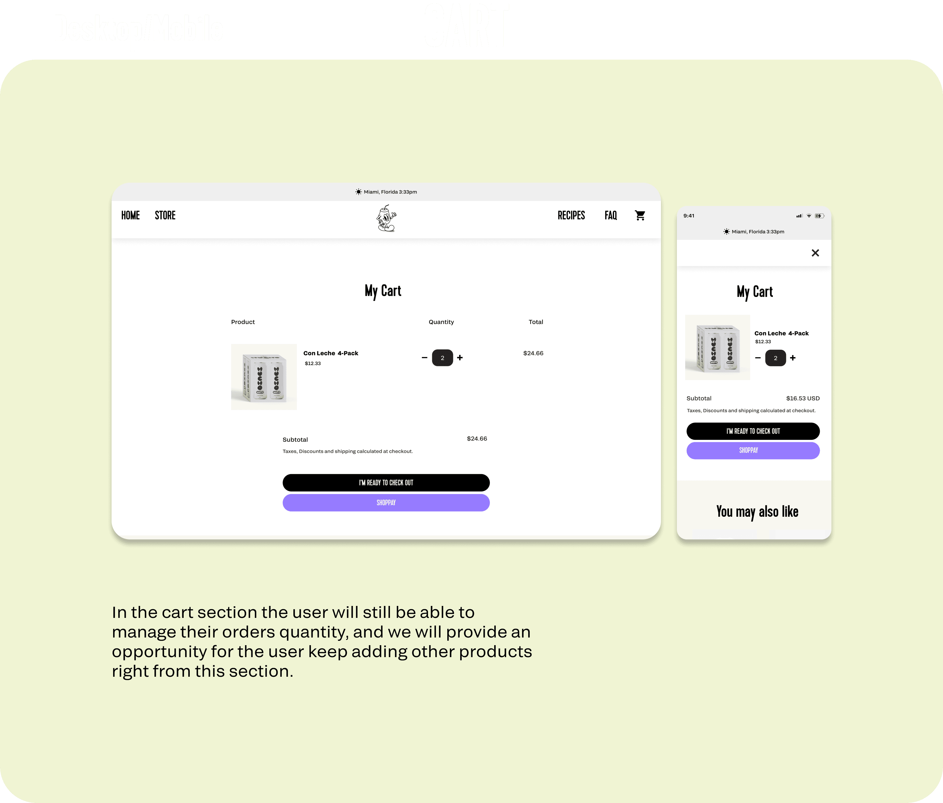
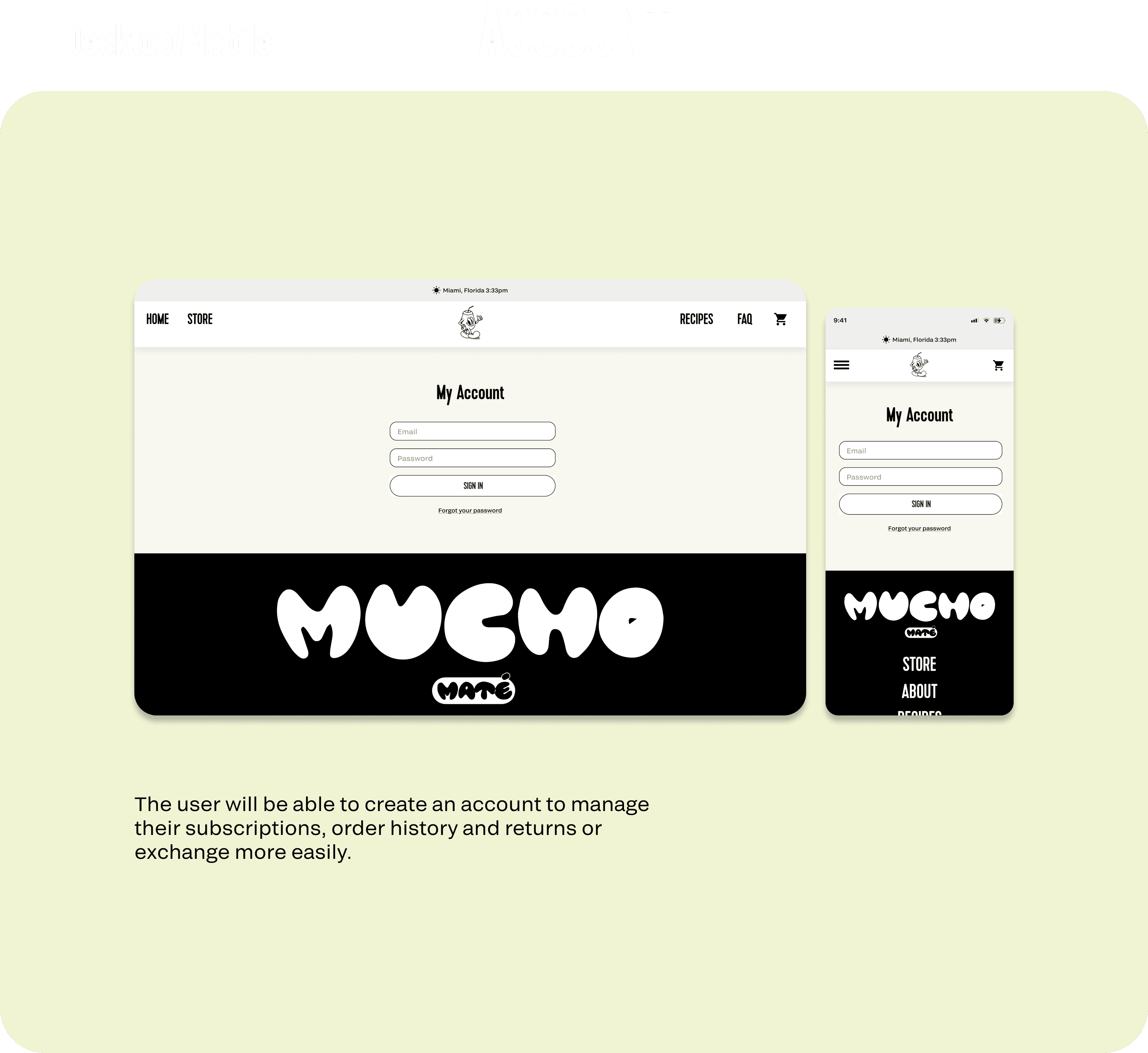
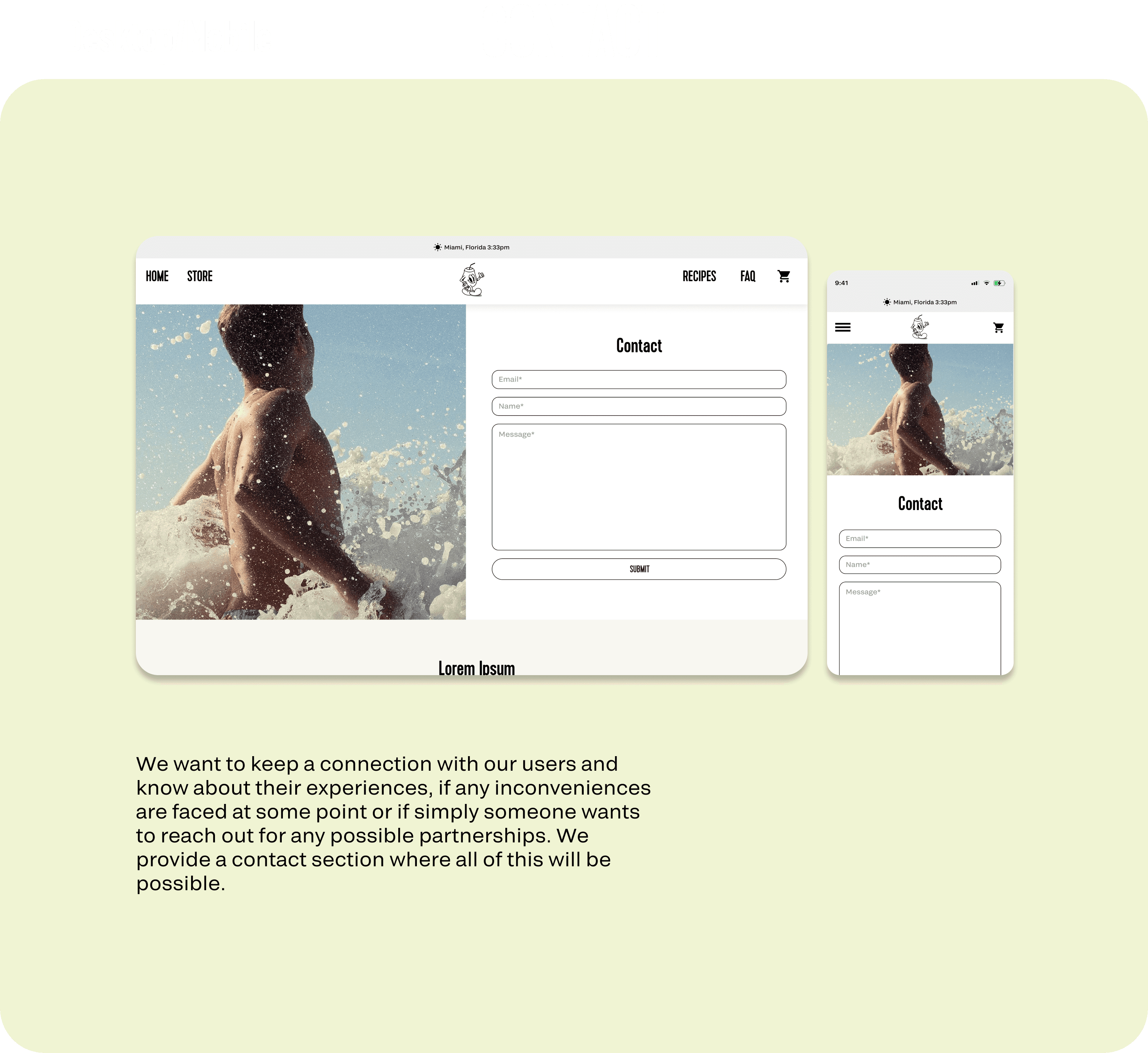
The initial lo-fi wireframes were made for mobile version. After these were defined and taken to completion on hi-fi wireframes we continued with the desktop version only this time around we skipped lo-fi wireframes for desktop and proceeded to work on hi-fi wireframes directly due to the time constrains.
LOW-FIDELITY WIREFRAMES
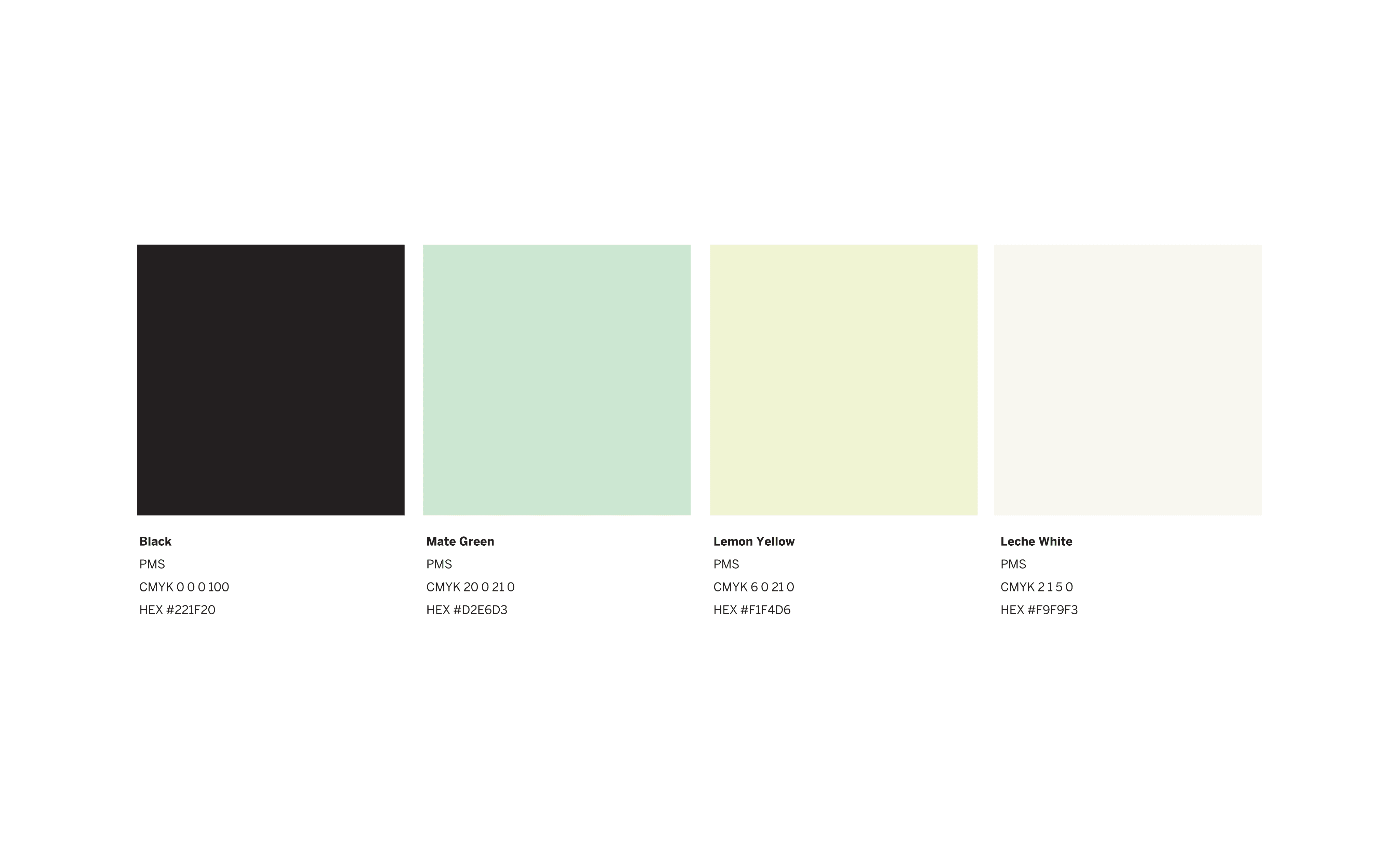
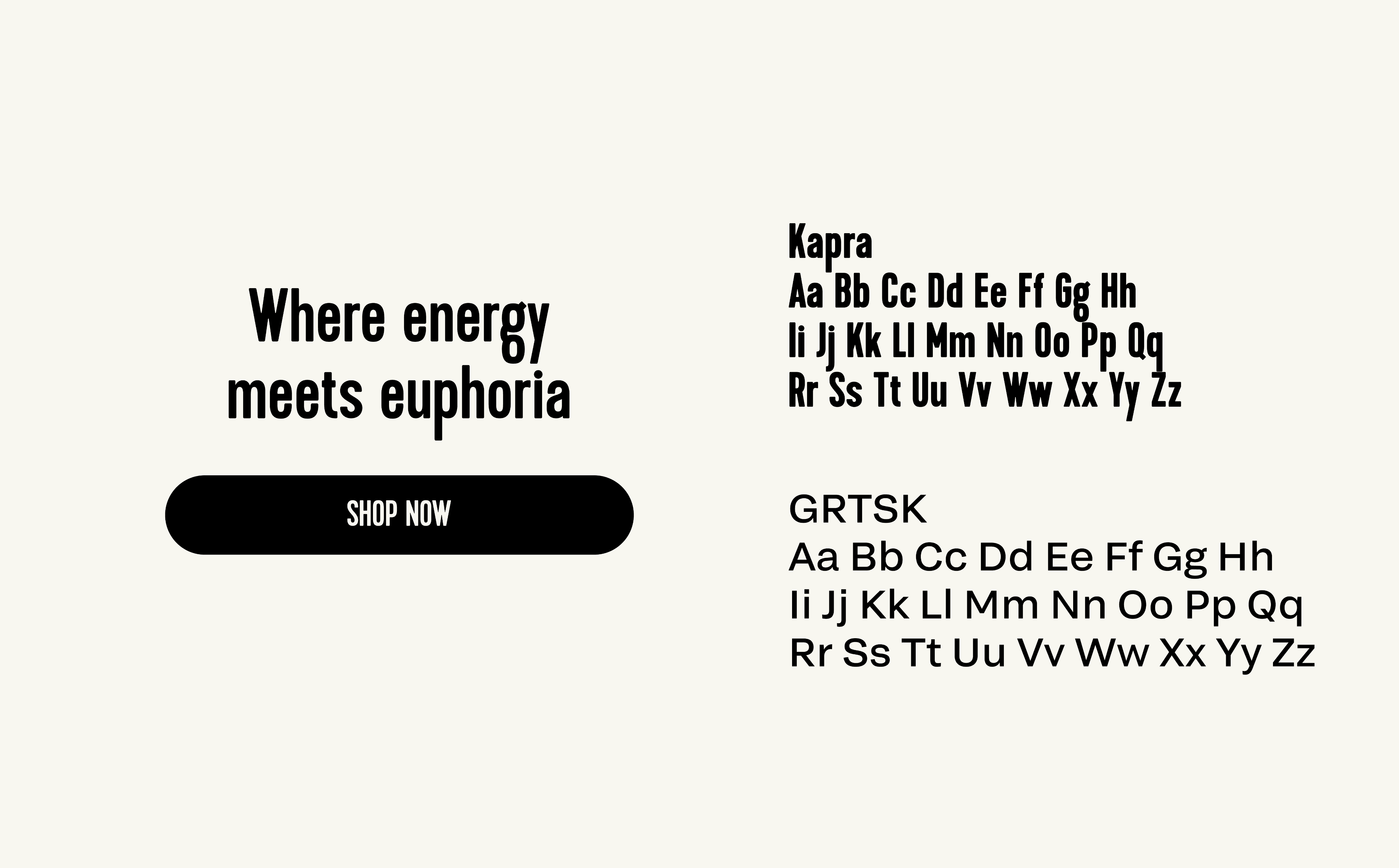
Brand identity




Solution
After performing the adequate research we came to the conclusion that having a minimal approach for Mucho Mate website will allow us to reach said goals.
Please tag along so you can enjoy the process as much as we did.
Problem Statement
Description
Since a particular interest about yerba mate was acquire, the idea of creating a new refreshing brand came to light. Mucho was created with the intent of providing a new healthier option to coffee as well as allowing the user to have fun and have a sense of community while navigating the website.
How can we provide an easy way for customers to purchase Mucho Mate.





MUCHO MATE - E-COMMERCE WEBSITE / UX UI PROJECT


Key takeaways:
Majority of the websites have similar menu pages (Shop/products, blog, about us, contact us).
Around a 60% of the websites offered subscription plans.
Use of CTA buttons on homepage directing users to products.
Around 80% of the websites focus on having an entertaining homepage design promoting better engagement.
Majority of websites did not have categories for products/doesn’t seem to be necessary for the user.
Lack on accessibility in some websites due to low contrast in the design.
Websites showed a clear concept of the brand overall leaving an impact on the user.
Consistent use of imagery and typography throughout the pages.
Websites that showed great performance provided an easy and simple shopping experience. Ex: Different payment options, where to find the products, easy access to subscription plans and easy management of subscription settings.
Easy access to reviews.
Based on these assumptions we will continue by creating the structure of the website and work on iterations. This will provide valuable information and will help us prioritize and organize the pages and elements that will be included on the same.
The logo and mascots were provided to me during the design process. The idea of the stakeholder was to have an emblematic symbol easy to recognize when you think of mate which in this case was the mate cup highlighting the fun personality of the brand. The website design was based on these characteristics.


Problem & Solution
Solution
After performing the adequate research we came to the conclusion that having a minimal approach for Mucho Mate website will allow us to reach said goals.
Please tag along so you can enjoy the process as much as we did.
Problem Statement
Description


Since a particular interest about yerba mate was acquire, the idea of creating a new refreshing brand came to light. Mucho was created with the intent of providing a new healthier option to coffee as well as allowing the user to have fun and have a sense of community while navigating the website.
How can we provide an easy way for customers to purchase Mucho Mate.

Design Process
COMpetitor analysis

Sitemap

Mucho is a Miami based mate beverage company tailored to a young demographic looking for a healthier alternative to coffee. Mate is currently in their final stages before launching.
In charge of:
Initial research
Lo-fi & Hi-fi wireframes
Photography assistance
User testing
The following sitemap proposes the best practices to achieve these results based on the data provided by the research previously performed. From this point, our approach for Mucho Mate website was to minimize the number of pages, allowing us to reach said goals. The website will be composed by a homepage where it will showcase customers opinions and experiences about the product alongside fun and creative photography and imagery, an account option for the user to manage their settings regarding subscription plans and lastly a menu. The menu will display multiple sections such as collection, contact us, blog, about us and FAQ. Is worth mentioning the homepage will provide ways to be interconnected with the Collection section to allow easy access and motivate the users to check the products.
LOW-FIDELITY WIREFRAMES
Brand identity


The initial lo-fi wireframes were made for mobile version. After these were defined and taken to completion on hi-fi wireframes we continued with the desktop version only this time around we skipped lo-fi wireframes for desktop and proceeded to work on hi-fi wireframes directly due to the time constrains.



MUCHO MATE - E-COMMERCE WEBSITE / UX UI PROJECT
Mucho is a Miami based mate beverage company tailored to a young demographic looking for a healthier alternative to coffee. Mate is currently in their final stages before launching.
In charge of:
Initial research
Lo-fi & Hi-fi wireframes
Photography assistance
User testing
Problem & Solution
Solution
After performing the adequate research we came to the conclusion that having a minimal approach for Mucho Mate website will allow us to reach said goals.
Please tag along so you can enjoy the process as much as we did.
Problem Statement
Description
Since a particular interest about yerba mate was acquire, the idea of creating a new refreshing brand came to light. Mucho was created with the intent of providing a new healthier option to coffee as well as allowing the user to have fun and have a sense of community while navigating the website.
How can we provide an easy way for customers to purchase Mucho Mate.


Design Process
The logo and mascots were provided to me during the design process. The idea of the stakeholder was to have an emblematic symbol easy to recognize when you think of mate which in this case was the mate cup highlighting the fun personality of the brand. The website design was based on these characteristics.

COMpetitor analysis

Key takeaways:
Majority of the websites have similar menu pages (Shop/products, blog, about us, contact us).
Around a 60% of the websites offered subscription plans.
Use of CTA buttons on homepage directing users to products.
Around 80% of the websites focus on having an entertaining homepage design promoting better engagement.
Majority of websites did not have categories for products/doesn’t seem to be necessary for the user.
Lack on accessibility in some websites due to low contrast in the design.
Websites showed a clear concept of the brand overall leaving an impact on the user.
Consistent use of imagery and typography throughout the pages.
Websites that showed great performance provided an easy and simple shopping experience. Ex: Different payment options, where to find the products, easy access to subscription plans and easy management of subscription settings.
Easy access to reviews.
Based on these assumptions we will continue by creating the structure of the website and work on iterations. This will provide valuable information and will help us prioritize and organize the pages and elements that will be included on the same.
Sitemap

The following sitemap proposes the best practices to achieve these results based on the data provided by the research previously performed. From this point, our approach for Mucho Mate website was to minimize the number of pages, allowing us to reach said goals. The website will be composed by a homepage where it will showcase customers opinions and experiences about the product alongside fun and creative photography and imagery, an account option for the user to manage their settings regarding subscription plans and lastly a menu. The menu will display multiple sections such as collection, contact us, blog, about us and FAQ. Is worth mentioning the homepage will provide ways to be interconnected with the Collection section to allow easy access and motivate the users to check the products.

The initial lo-fi wireframes were made for mobile version. After these were defined and taken to completion on hi-fi wireframes we continued with the desktop version only this time around we skipped lo-fi wireframes for desktop and proceeded to work on hi-fi wireframes directly due to the time constrains.
LOW-FIDELITY WIREFRAMES

Brand identity


